
Client
Bayer One A Day
Year
2018
Role
Visual Designer
Team
Alina Peña (Jr Designer)
Joey Unnold (UX)
Gilian Salit (ACD)
Cavan Huang (CD)
Reinvigorating nutrition for every lifestyle
The One A Day brand has been providing nutritional support for decades but in a time when the competitive environment is more crowded than ever, One A Day was at risk of being left behind. With a confusing and dull site experience, users found it challenging to find the right product, understand product benefits and there was no way for consumers to purchase online.
One A Day asked us to make their multivitamin relevant for a younger audience. We knew nowadays, people prefer to do their own research and take health into their own hands, but we also were aware oftentimes laziness cuts that short.
We repositioned OAD as a guide and trusted partner and energized their brand with a facelift across their digital platforms. The much needed redesign and optimization provided users with a simple path to everyday wellness and drove young customers to purchase.

the concept
The ‘Your One A Day Is Showing’ digital campaign was centered around playfulness and a lighthearted attitude. OAD multivitamins are full of goodness that gives people the confidence to do awesome things. We elevated the emotional and nutrient benefits without going deep into the scientific claims. We brought it to life on Facebook and Instagram, with short spots featuring expressive bursts of energy and color.


Function
We built the One A Day site around a modular and user-centric approach that made finding the right product an intuitive and informative process. The homepage was category driven with large tiles that differentiated the user type. Users knew what areas to start their searches (ex. women's or men's products) and used the “Why OAD” page to determine which products would be best.
Form
We used a vivid color palette and lively photography across the digital campaign that instantly evoked the vibrancy of the One A Day brand. Bold type, simplified packaging, and saturated colors all helped users seamlessly navigate between product categories.


The redesign improved and clarified the tools needed to buy and save. The structure of the navigation was simplified to match consumer language to help visitors begin their journey to conversion.


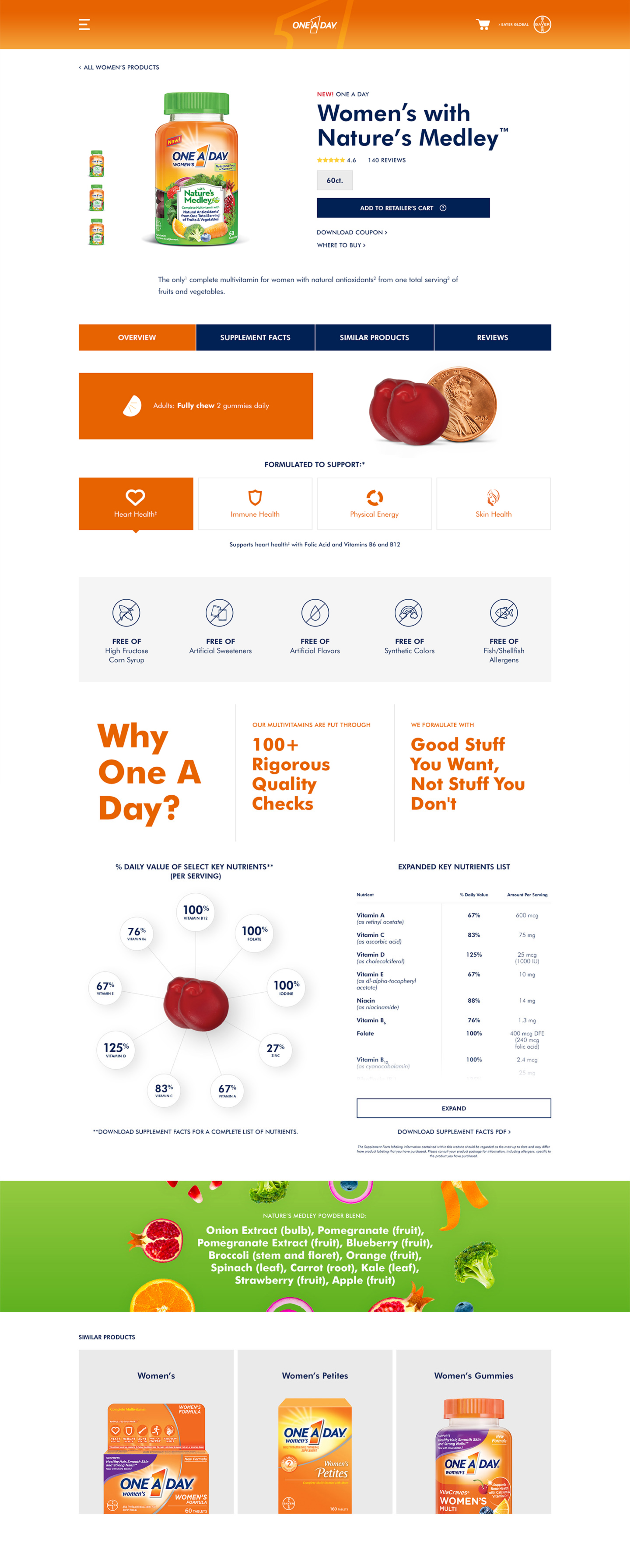
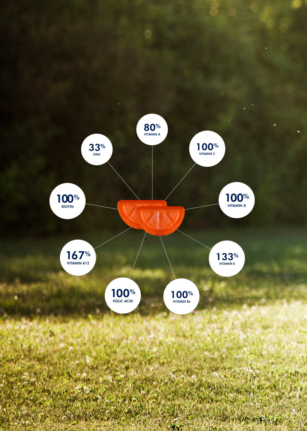
We educated users about vitamins, nutrients and minerals with relevant article content and an infographic approach, empowering them to choose One A Day as their multivitamin. The redesigned experience shows users, from browsing to buying, how One A Day helps you thrive.