CLIENT
Dow Jones,
Barron’s Advisor Team
YEAR
June 2018
SKILLS
User Experience Design and Research
Rebuilding a conference portal for finance giant
Dow Jones’s brand, Barron’s Advisors puts on worldwide conference summits throughout the year to attracting financial professionals and giving them a dedicated space to share industry knowledge, upskill, and network.
Their conference ecosystem was vast and wasn’t purpose-built for the amount of events they now put on, making information spread across 10 websites and hard to navigate.
The Dow Jones team running their Barron’s Advisor product hosts regional conferences worldwide every year. Primarily similar in topic, they organized these conferences across 5-10 separate websites. Looking to consolidate the experience and promote multi-conference engagement from their target users, our small team got to work on creating an appropriate digital solution.
GETTING STARTED
The project kicked off in early August June 2018. I worked with the team through final hi-fidelity wireframes after a 3-month timeline that included discovery, strategy, and execution.
Our team was composed of a visual designer, product manager, engineer, with myself as the sole UX designer posed to hand off to a new UX designer
During our discovery phase, I worked with the brand lead, marketing team, conference planning team, and the project team explore the conference’s history and understand their own research on performance and engagement.
We conducted stakeholder interviews across the business to understand why the current digital experience structure, determine KPI’s, identify competitors, and gain more perspective on our end user and use cases. I used that to conduct a competitor analysis.
To be able to shift our content to the new portal, I conducted a content inventory to understand, track and manage existing and upcoming content.
Lastly, to capture the business desires, I conducted deep-dives and ‘Hopes & Fears” sessions with the Barron’s team to understand where we want to evolve the journey and what business decisions would effect the end product.
OUR USERS
Using existing research and supplementing that with user surveys, we had a better idea of their pain points and what they wanted the next generation of Barron’s Advisor Summit sites to do for them. We built user personas and documented their use cases to better inform our design in future steps.
Time Spent
All of our users were concerned with how the time spent compared to the values gained either for themselves, their clients, or their businesses.
Cost-Efficiency
They needed the price to match up with potential connections and learnings they could gain by attending as for some users, they would be pausing business activities to attend
Competitive Advantage
Lastly, it was imperative to know who would be in attendance to see if networking and learning would be worthwhile or if they would jsut be surrounded by similar-level peers.
INFORMATION ARCHITECTURE
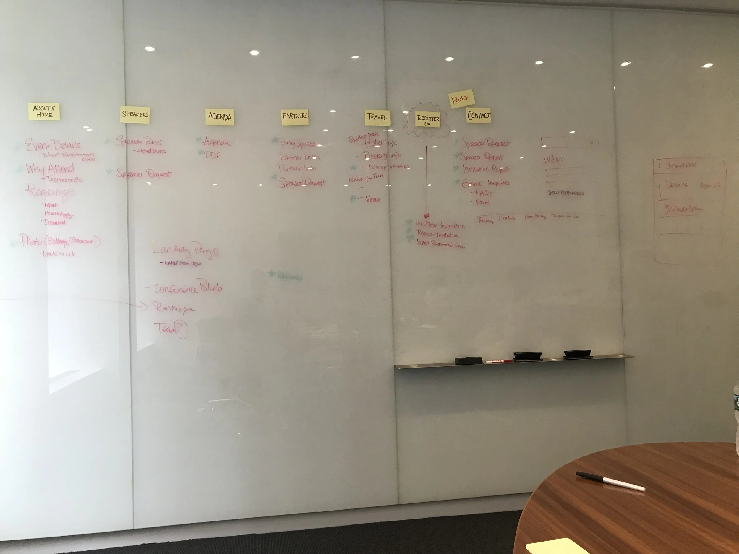
To start organizing the new site experience, I led open moderated card sorting exercises with the full Barron’s team to better understand the dynamics around the users from their perspective. We then worked to co-create the site architecture in a way that mapped back to the business needs. From their we determined the user flow for our 4 user types and iterated towards a site map that was feasible and viable.
Decision Drivers - Customer Research
Most of the users preferred attending topic-based conference instead of regional conferences. We translated that to content across the site by segmenting based on conference type and deprioritizing the regional conferences
With some variance with users’ views of conference planning items, we narrowed their options by combining similar content and tightening the language.
FROM STAKEHOLDER RESEARCH
For the primary audience, the navigation was structured and built around carefully guiding the user through the conference ecosystem and balancing their wants with key pathways to their transactional needs at each point of their journey from conference discovery to conference registration. We opted for a landing page with information that applied generally to the ecosystem and then gave users the opportunity to drill down into individual event.
The categories that stakeholders wanted to promote most, were prioritized and surfaced. Those being Financial Leader Rankings
WIREFRAMES
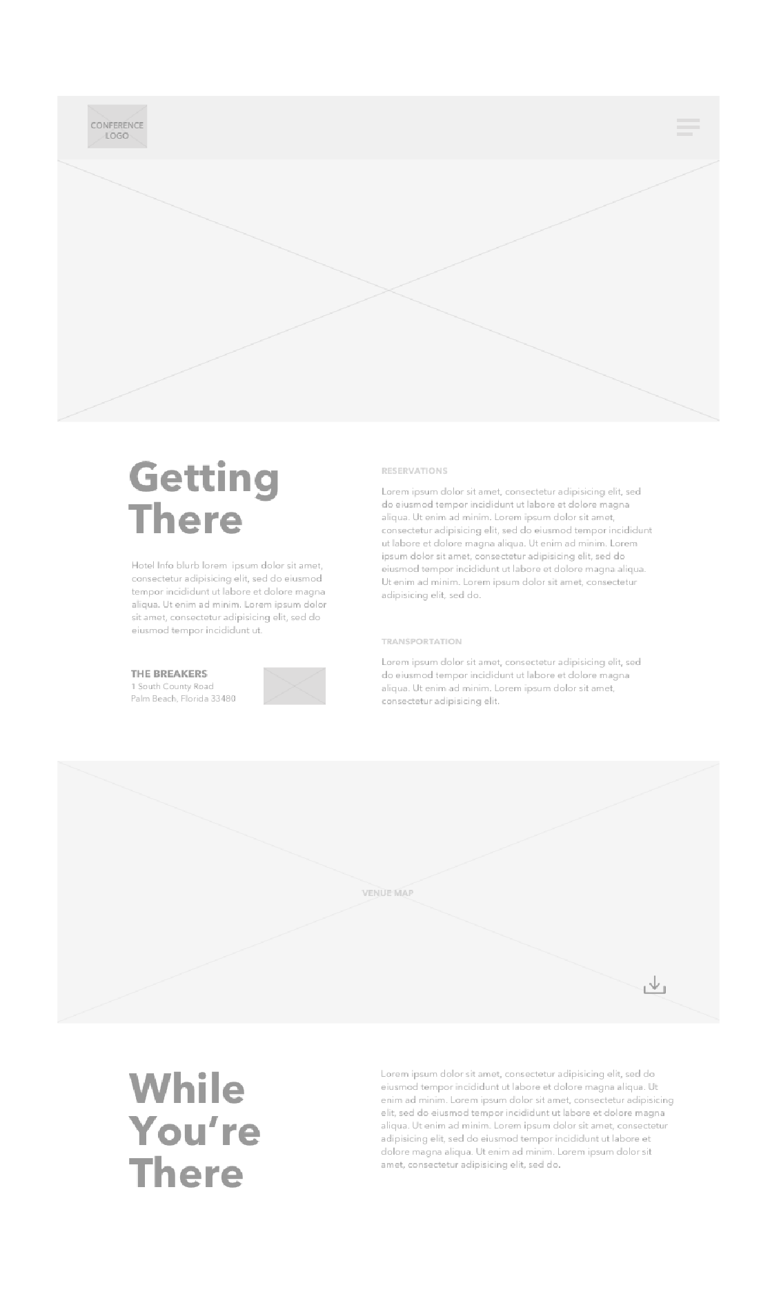
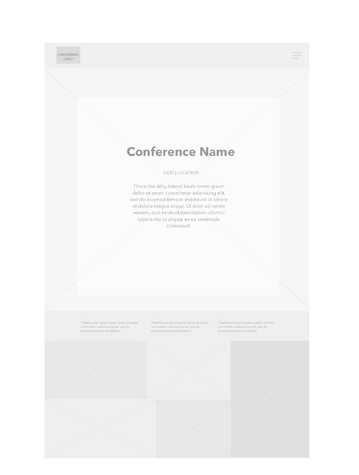
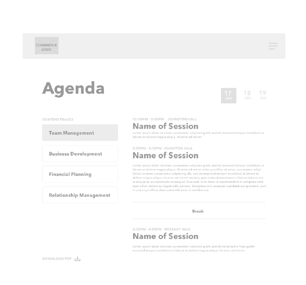
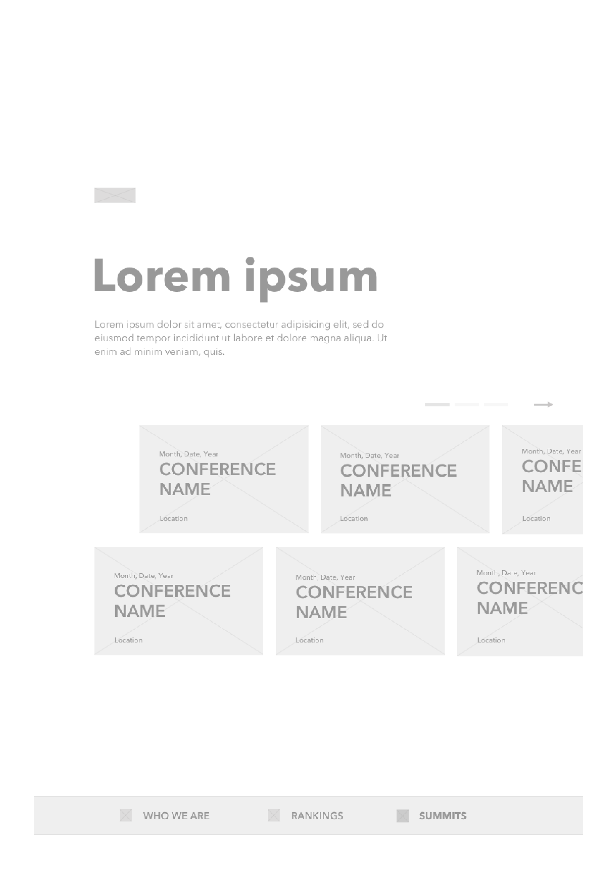
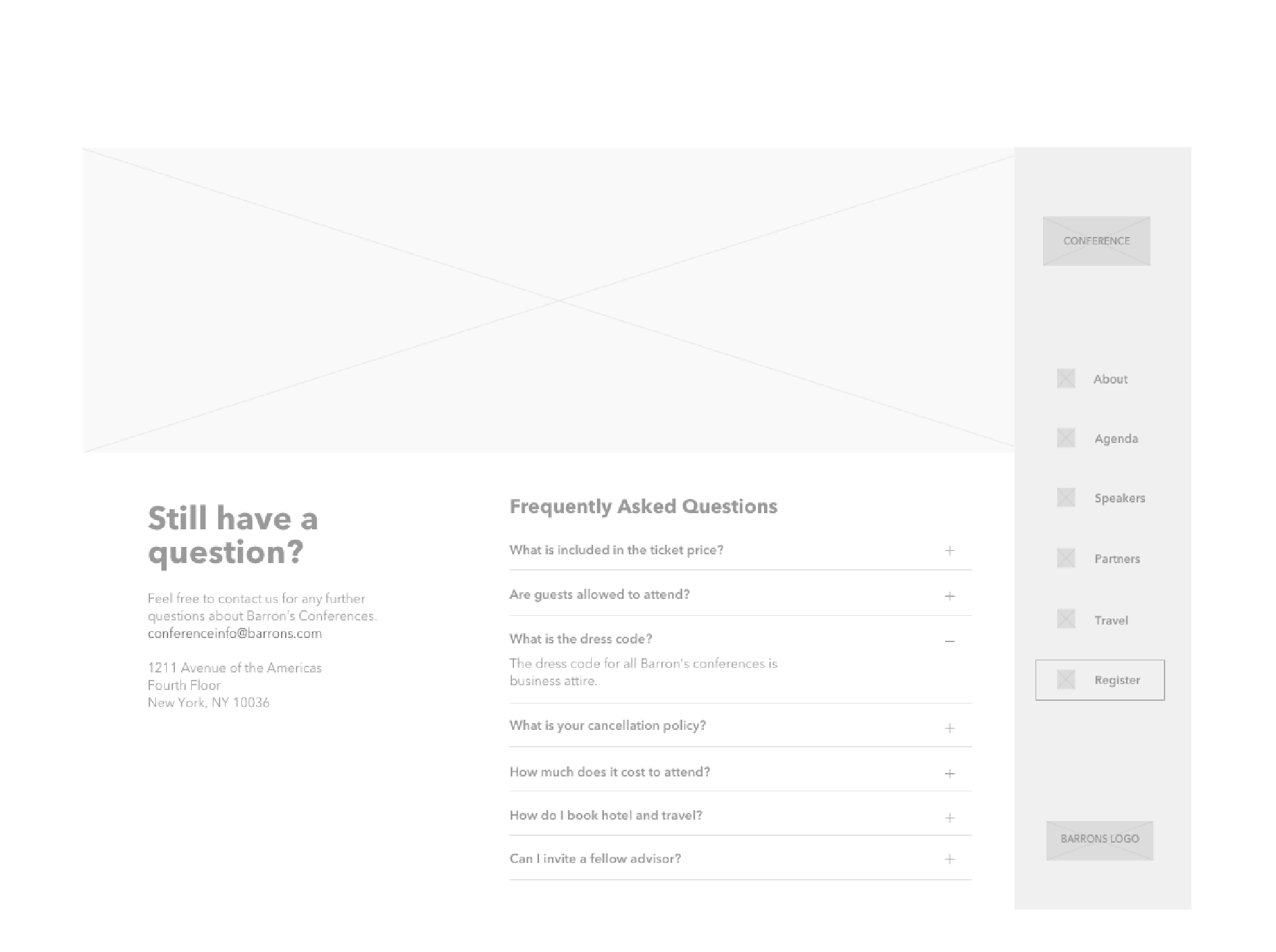
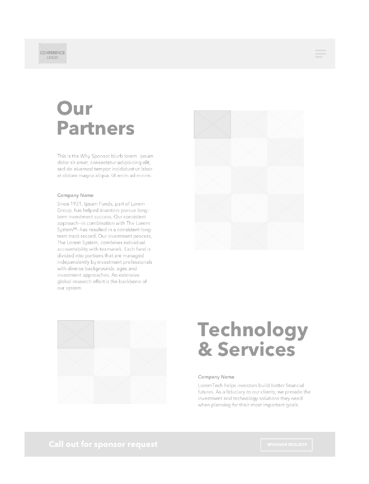
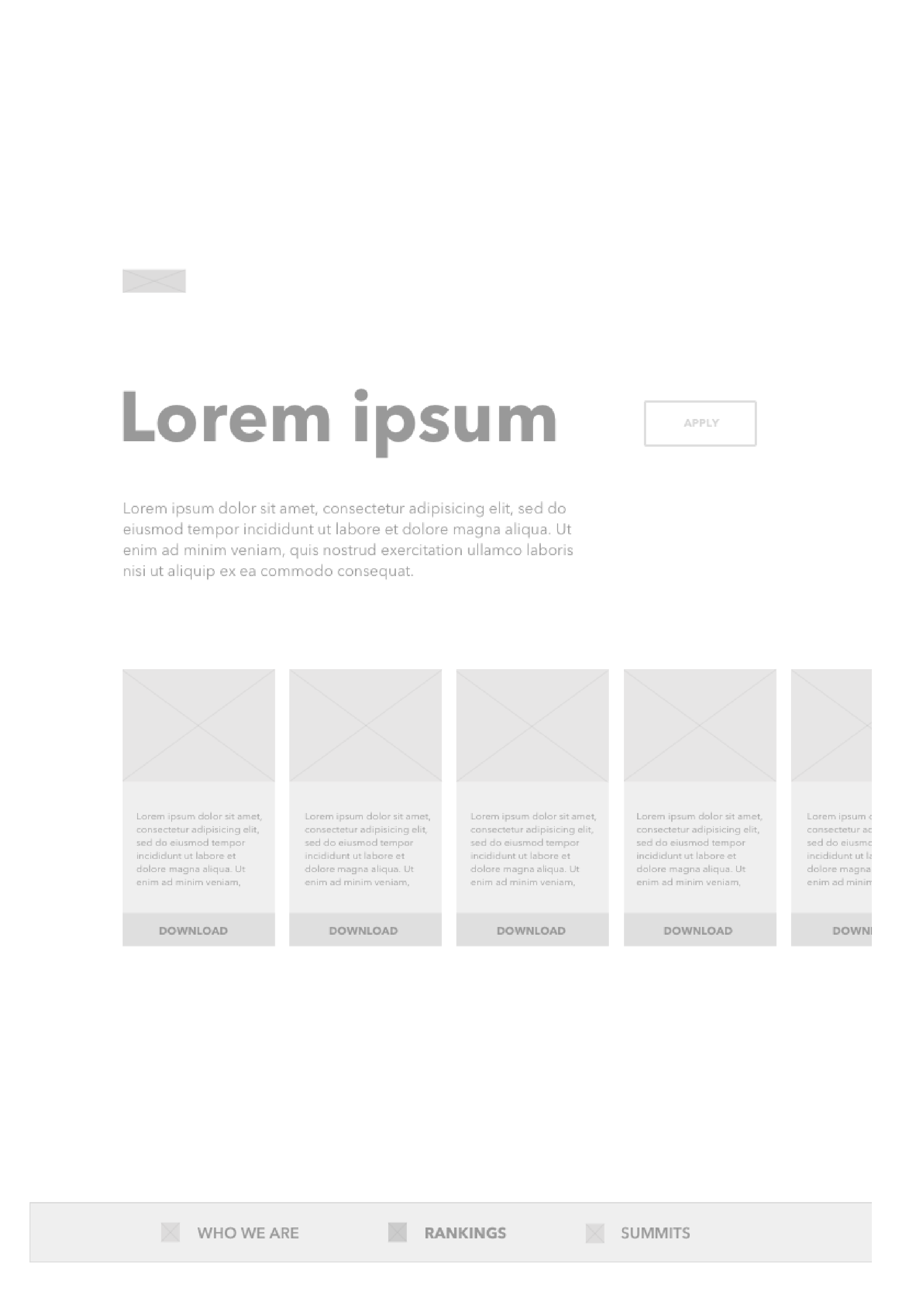
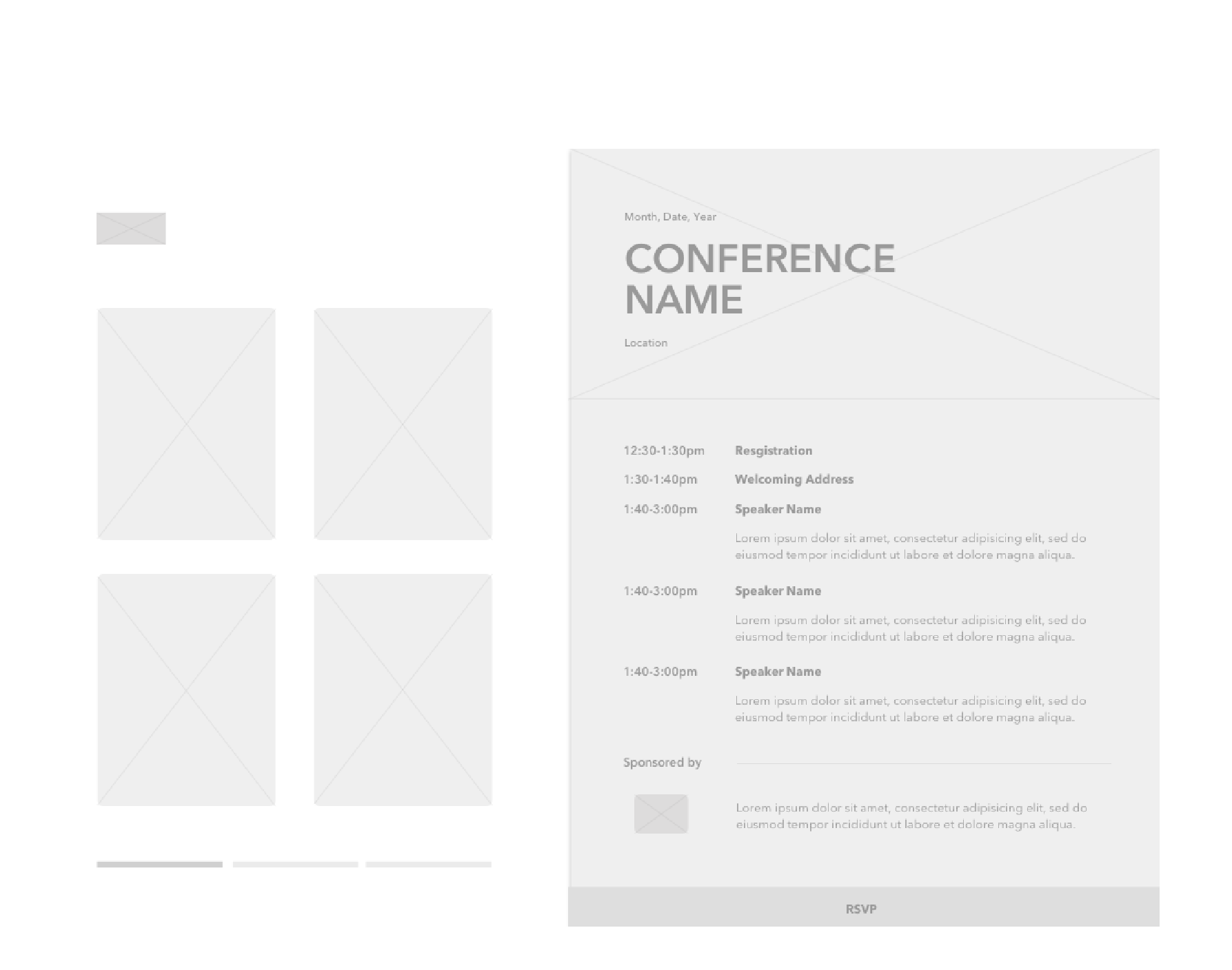
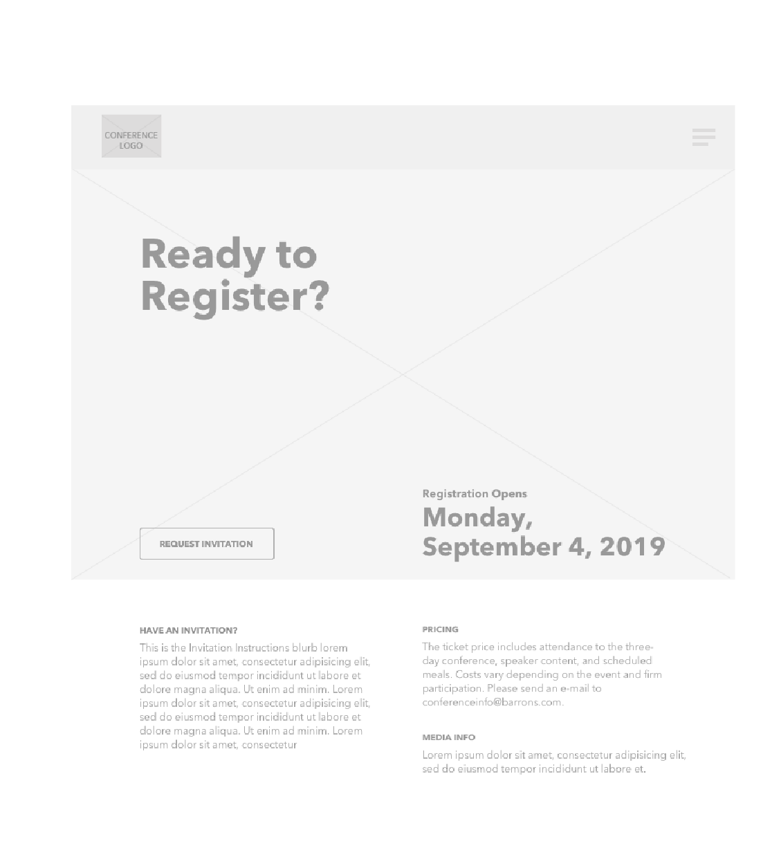
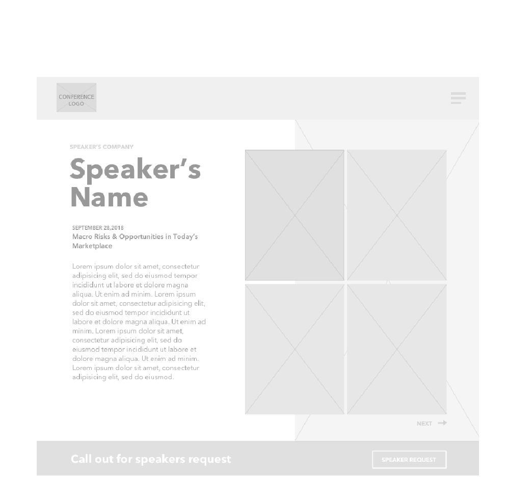
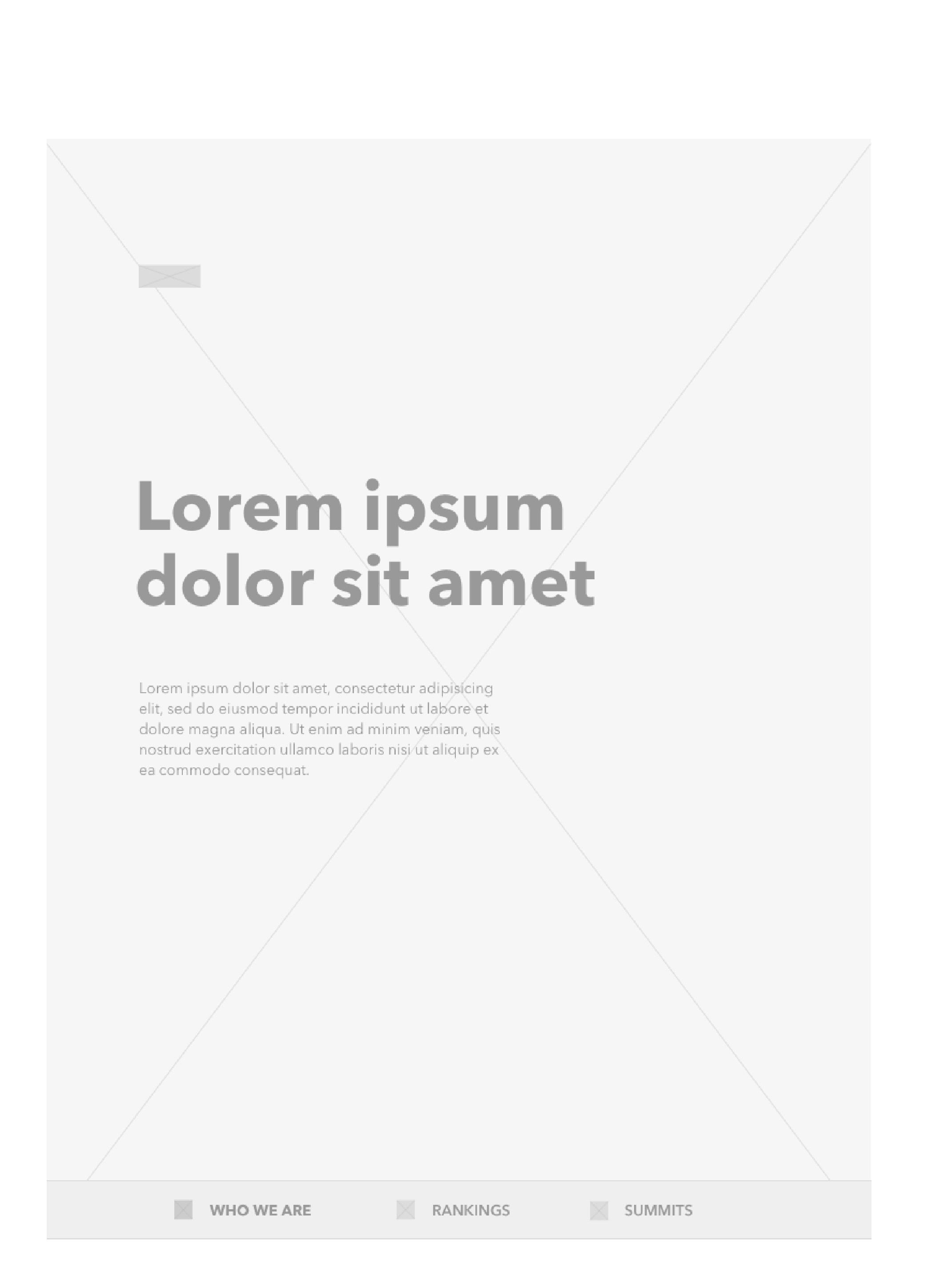
Equipped with our site map and flow charts, I built low-fidelity wireframes to help the team work out any remaining kinks in the solution on desktop and mobile and then iterated on high-fidelity wireframes that we could test internally, with stakeholders, partners, and externally with our end users.
Next Steps
After developing hi-fidelity wireframes and a testable prototype, I transitioned from the team and passed my work on to the incoming UX designer. I tasked her with continuing iteration on the wireframes and setting her up to remotely test with users in the financial industry and presenting to internal stakeholders. After her testing and implementing feedback, I advised her to update the prototype, test again with recorded user sessions. From there, the senior visual designer would work closely with her to integrate her design system and together build mockups. When I transitioned, I left the project to her to handoff and manage the build with our engineer.

